The Role of Colors in Jewelry Packaging
In the jewelry industry, presentation is almost as important as the product itself. A sparkling diamond ring, a delicate gold necklace, and a set of pearl earrings are more valuable to customers. This is especially true when they come in beautiful and well-designed packaging. One of the most powerful elements of packaging design is color.
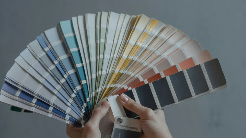
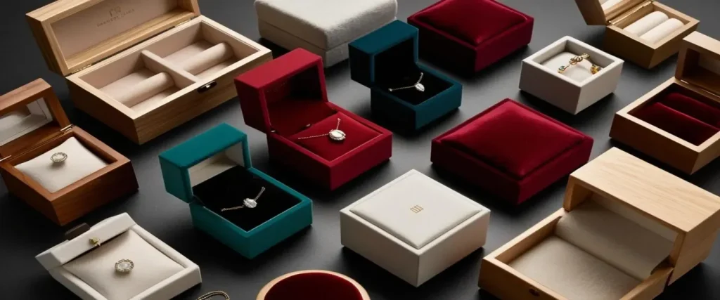
Colors have the power to evoke different emotions, influence purchasing decisions, and create a sense of value and luxury. For jewelry brands, especially luxury ones, picking the right color can help them stand out or blend in.
In this article, we will look at how colors affect jewelry packaging. We will discuss the most popular colors in the industry. We will also assess how these colors align with your brand identity. Finally, we will explain why color choices are important for brand recognition and customer loyalty.
Why Colors Matter in Jewelry Packaging
In marketing psychology, colors can influence mood, create expectations, and even trigger memories. For jewelry brands, this means color selection should be intentional and strategic.
- Create an emotional connection: Packaging colors can make customers feel excited, calm, or even nostalgic. This emotional link encourages brand loyalty.
- Support your brand’s identity: Every brand has a personality. Your packaging colors should match your brand’s story, values, and market positioning.
- Enhance product perception: The right color can make your jewelry feel more luxurious, eco-friendly, modern, or timeless.
- Improve brand recognition: Customers are more likely to remember a jewelry brand with consistent and unique packaging colors.
Popular Colors in the Jewelry Industry
Trends change over time, but some colors stay popular for jewelry packaging. This is due to their strong emotional and visual impact.
1. White Packaging – Pure and Elegant
White packaging is timeless. It communicates purity, simplicity, and elegance—qualities many luxury brands value. White is also incredibly versatile, making it easy to pair with metallic foils, embossing, or ribbons for a high-end look.
In the jewelry industry, white is often used by brands that want to emphasize craftsmanship and sophistication without distracting from the product itself.
2. Black – Sophistication and Mystery
Black is a favorite among high end brands because it exudes exclusivity and power. It’s bold, sleek, and instantly associated with luxury. Black packaging can also create a dramatic contrast with metallic gold or silver logos, making the design pop.
When used in jewelry packaging, black often creates a sense of mystery and allure, encouraging customers to explore what’s inside.
3. Gold – Prestige and Luxury
Gold is synonymous with wealth and celebration. While it’s not always used as the main color, it frequently appears as an accent in packaging design. A touch of gold foil or ribbon instantly upgrades the perceived value of the product.
4. Pastel Tones – Soft and Modern
Soft pinks, blues, and lavender have become increasingly popular for jewelry packaging targeting younger audiences. These popular colors feel approachable, friendly, and fresh while still maintaining a premium appeal.
5. Eco-Friendly Tones – Natural and Sustainable
As more brands embrace eco friendly values, earthy tones like kraft brown, muted greens, and soft beige are making their way into luxury packaging. These colors signal sustainability and responsibility, appealing to environmentally conscious customers.
Choosing eco-inspired colors can also position your brand as forward-thinking and socially responsible.
How to Choose the Right Color for Your Jewelry Packaging
Your packaging is more than just a container—it’s a packaging solution that speaks for your brand. Here’s how to choose the right color that truly reflects your brand’s essence.
1. Align with Your Brand Identity
Colors should reflect your brand’s identity—its values, target audience, and personality. For example:
- A luxury jewelry brand may lean toward black, gold, or white for a premium look.
- An eco friendly brand might prefer kraft brown or muted green to signal sustainability.
- A playful, youthful jewelry line could use bright or pastel tones for a fun, modern vibe.
2. Understand Your Audience
Ask yourself: Who is buying your jewelry? A gift buyer? A bride-to-be? A collector? Different audiences respond to different colors.
- Gift buyers may be drawn to red or gold for special occasions.
- Brides might prefer soft ivory or champagne tones.
- Collectors may appreciate understated colors like navy or charcoal.
3. Consider Product Type and Price Point
High-value items often work best with darker, more sophisticated colors, while affordable, everyday pieces can shine in lighter or more playful packaging colors.
Color Psychology in Jewelry Packaging
Different colors can influence how customers feel about your brand and your products. Here’s a quick look at how some common packaging colors affect perception:
- White: Purity, elegance, simplicity.
- Black: Power, luxury, exclusivity.
- Gold: Wealth, celebration, prestige.
- Green: Sustainability, nature, calmness.
- Blue: Trust, stability, sophistication.
- Pink: Femininity, romance, warmth.
When paired strategically, these colors can enhance your packaging’s visual appeal and emotional impact.
The Eco-Friendly Shift in Jewelry Packaging Colors
In recent years, eco friendly values have influenced color choices in the jewelry industry. Brands are moving toward natural, uncoated papers, muted earthy tones, and minimal printing to reduce environmental impact.
This doesn’t mean luxury is sacrificed—high-end brands are proving that sustainability and elegance can go hand in hand. Matte textures, embossed logos, and carefully chosen packaging colors can still make a strong statement while respecting the planet.
How Color Boosts Brand Recognition
Consistency is key when it comes to brand recognition. Using the same set of colors across all your packaging solutions—from boxes to bags to ribbons—ensures customers instantly associate those colors with your brand.
When customers see a signature color combination, they should be able to identify your brand without even reading the logo. That’s the power of color in marketing.
Yaneng Packaging – Your Partner in Custom Jewelry Packaging
If you’re looking for a partner to bring your color vision to life, Yaneng Packaging is here to help. As a professional manufacturer specializing in jewelry packaging, Yaneng offers a wide range of packaging solutions—from eco friendly designs to luxury jewelry boxes tailored to your brand’s identity.
Here’s what makes Yaneng Packaging a trusted name:
- Reliable manufacturer: 20+ Years of Jewelry Packaging Manufacturer
- Offering Recyclable Jewelry Packaging
- Free 3D Design Service
- Large Stock Available
- Only MOQ 1 is Required to Bring the Jewelry Packaging Home
- Free Jewelry Packaging Sample
- 1 Year After-Sales Guarantee, Your Confidence Guarantee
Their commitment to quality, innovation, and sustainability means your packaging protects your jewelry and makes a lasting impression.

With years of experience serving high end brands and emerging jewelry brands alike, Yaneng understands how to use packaging colors to create lasting impressions, boost brand recognition, and create an emotional connection with customers.
Whether you want white packaging for timeless elegance, pastel tones for a modern feel, or sustainable hues that align with your values, Yaneng can help you choose the right color and deliver packaging that matches your brand perfectly.
Conclusion
In the jewelry industry, color is not just decoration. It is a tool that shapes how people see your brand. Color helps build loyalty and makes your products stand out. From the timeless purity of white to the prestige of gold and the sustainability of earthy tones, popular colors in jewelry packaging have the power to shape customer experiences and expectations.
The next time you design your packaging solutions, remember: color can create a sense of luxury, connect with emotions, and strengthen your brand’s identity.
Ready to make your jewelry packaging unforgettable?
Contact Yaneng Packaging today and let us help you create stunning, color-perfect packaging that speaks directly to your customers’ hearts.


